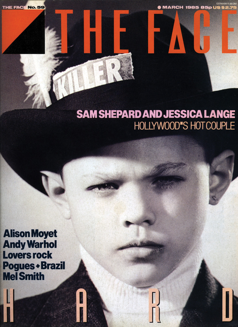
30年以上にわたり多大な影響を与え続ける、デザイン界の巨匠、ネヴィル・ブロディ。彼とアソシエイツが今回GINZAのために8ページを特別にレイアウト。「○○を疑え」という挑発的なテーマを、オリジナル書体を使い、大胆かつ緻密に配置した、ファッションとタイポグラフィの素晴らしき邂逅。本誌では収まりきらなかった、ネヴィル氏のインタビューを全文でお届けします。
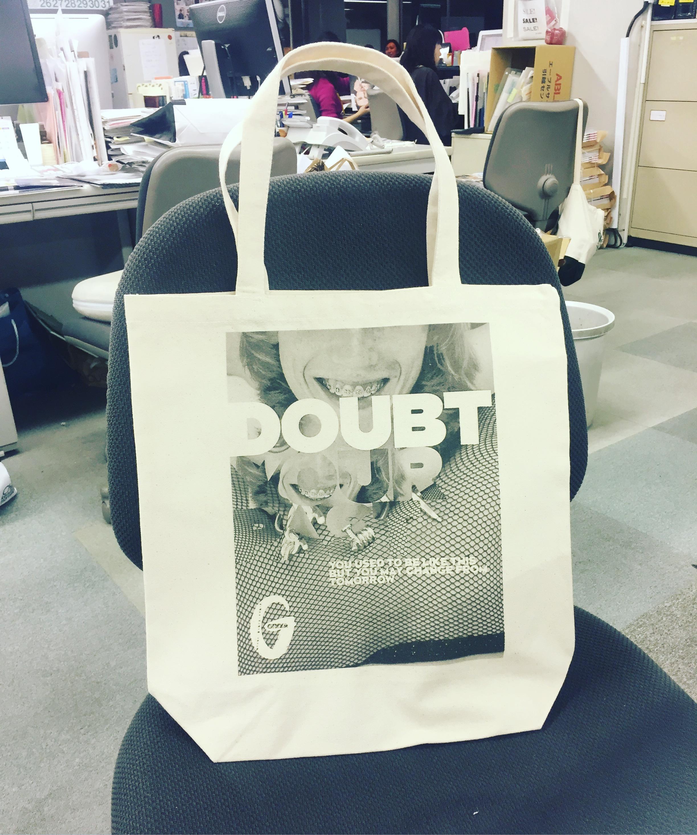
(トップ画像のトートは今回のネヴィル氏とGINZAとのコラボを記念して作った限定アイテム。代官山蔦屋書店の書店フロアで展開している「GINZAガールの家」で発売中です。11/18まで)
((前編))
Q1
ネヴィルさんは、レコードジャケット、雑誌、新聞、webやCIロゴとさまざまな媒体を表現の場として活躍されてきましたが、タイポグラフィを生み出す時は、読みやすさ(legibility)との兼ね合いがつねに生じると思います。
他媒体と比べて、今回のようなエディトリアルデザインにおけるタイポグラフィの意味やあり方、気をつけている点を教えてください。(例:The Timesは読みやすさを念頭に置くが、雑誌の場合は写真とのバランスやインパクトを重視する…etc)
媒体ごとに求める表現(の再現方法)は異なるもの。印刷物であればインクと紙の相性が重要ですし、デジタルであればデスクトップとモバイルのスケール感が重要。スケール感、プラッ トフォーム、オーディエンス(受け手)がつねに重要です。
今回の「タイポグラフィを疑え!」では、タイポグラフィが物語の一部となり、読者によりエモーショナルな体験をさせ、タイトルの裏にある「自身を疑え」というコンセプトを共有させる役割を果たしています。
*
Your works have always been diverse in terms of types of media such as designing magazines, newspapers websites, CI and so on. We would imagine you have thoughtfully designed and supplied typography suitable (legibility) and effective (visual effect) for each media.
For editorial design, like this special editorial project for GINZA, what is the role of typography and what are the things you carefully pay attention the most? (for example, project for The Times need strong focus in legibility whereas magazines would need more visual impact?)
Each media requires a different response. For print, you have to consider the effect of ink of paper, and in digital, the scaling of the screen from mobile to desktop. Scale is always important, platform is always important, and audience is always important.
For the GINZA project, typography is part of the narrative and effects how the reader experiences the story. It is a way of engaging the reader in a more emotional way, and sharing the underlining theme, which is about a bold questioning of ourselves.